The top trends for next year’s home designs are set to take their inspiration from a series of pastel and earth tones, according to paint manufacturer Valspar, Euronews reports.
The brand has unveiled a series of 12 colours it believes will set the tone for interior design next year, all of which it describes as “liveable neutrals” that cultivate a “safe, serene space” aiming to bring joy and comfort to homes.
"Earth's prescription for the chaotic, busy lives we all live is to bring the tranquility of nature and the outdoor world into the home. That's exactly what we set out to accomplish when forecasting the 2020 Colors of the Year," said Sue Kim, Valspar Color marketing manager at Sherwin-Williams.
"Take Mint Whisper, for instance. The crisp shade brings a sense of peace — and nature's positivity — indoors."
So what are the colours?
Pairing Winter Calm with earthy elements and natural textiles for a wholesome hangout, according to Valspar.
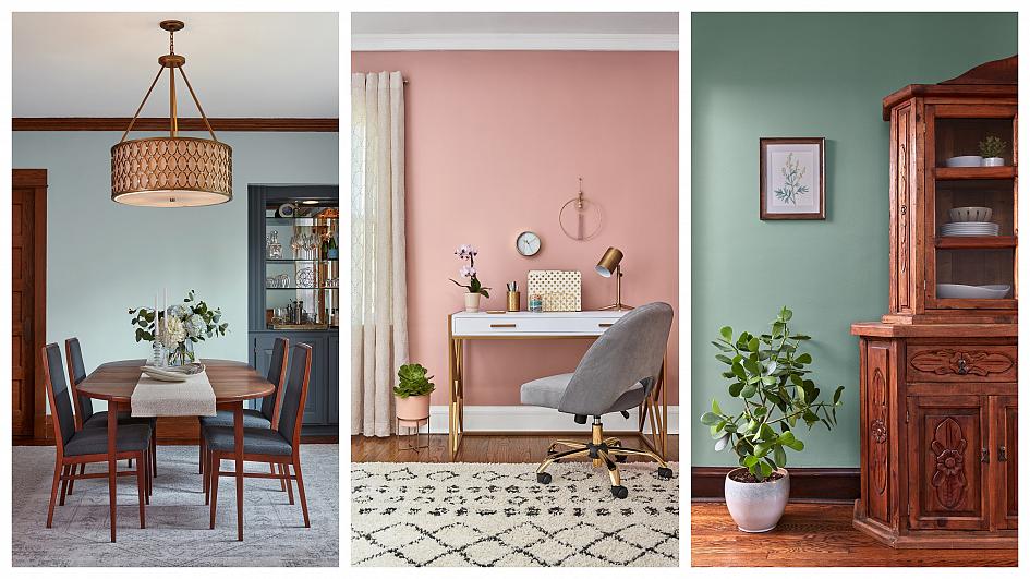
Meanwhile, Mint Whisper’s crisp hue is said to bring a sense of peace indoors and combined with white in small places can keep them feeling light and airy.
Canyon Earth is ideal for entryways, making for welcoming spaces that de-stress.
Tempered Sage is a spirited, sunny take on lime green that pairs well with natural wood tones, creating an earthy wholesome space, says Valspar.
The blue-grey cross that makes Grey Brook works in harmony with classic wood tones, creating a timeless look for sitting rooms.
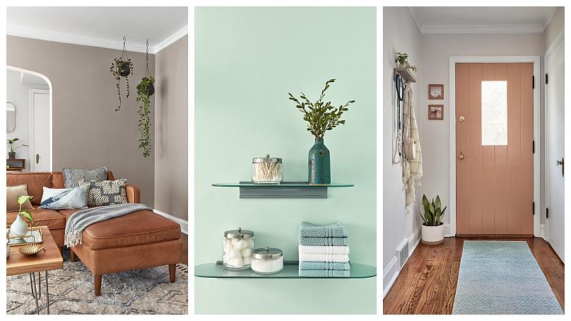
Desert Fortress, on the other hand, is a “comforting tone” that can act as a blank canvas in a variety of spaces. Valspar’s designers recommend it in a room filled with comfy furnishing, layered with plush blankets and pillows to create a relaxing atmosphere.
Jewel green Secluded Garden is intended to add a delicate touch of elegance and glamour to a room.
Bombay Pink complements gold furnishings to posh, new heights, says the brand. “A mature pink that is confidently cheerful like a spring sunset.”
Pale Powder is a fresh take on a warm neutral. Rooms decorated in the colour should feature woven baskets and wooden décor keep this nostalgic dusty apricot true to its retro roots.
Crisp whites and pristine chrome combine with tranquil Utterly Blue to create a spa-like retreat.
Secret Moss is a “naturally therapeutic” dusky green that creates a calming escape in any room. Soft neutrals and minimalist décor allow it to make a statement, says Valspar.
Finally, Crushed Out is a blush tone with a slight tint of pink that represents a new take on off-white. Surround with a contrast of greens, blues and reds to make this soft pink recede into a beautiful neutral backdrop.


Bütün xəbərlər Facebook səhifəmizdə


 USD
USD
 EUR
EUR
 GBP
GBP RUB
RUB